Grid systems have become key in web design, improving both looks and use. They act as a base, making digital spaces clear and organized. Designers use them to make layouts that look good and work well on all devices.
These systems, like column or modular grids, help organize complex info. This makes it easy for users to find what they need. Grids are also vital for making websites work well on different screens, from phones to desktops.
This flexibility helps designers avoid creative blocks. It also makes sure users have a smooth experience online.
Understanding Grid Systems in Design
Grid systems are key in design, helping to organize elements in a structured way. They provide a framework that makes sure content and graphics look good together on a page. Grids do more than just look nice; they help create a clear order that guides the viewer’s eye.
Definition and Purpose of Grid Systems
Knowing what a grid is helps us see their importance in design. Grids have columns, gutters, and margins that work together to bring order. Designers use different grids to create various looks and improve how users feel.
- Rule of Thirds: Divides compositions into thirds to foster emotional connections.
- Golden Section: Based on the golden ratio, this grid supports pleasing aesthetic arrangements.
- Single-Column Grids: Common in traditional formats, often seen in publications by experts like Ellen Lupton.
- Multi-Column Grids: Offer versatility for complex layouts, accommodating various content hierarchies.
- Modular Grids: Developed by Swiss designers, these grids feature horizontal and vertical divisions for structured layouts.
- Baseline Grids: Help anchor layout elements, enriching consistency by creating a rhythm across designs.
- Responsive Grids: Adapt to different screen sizes, ensuring a cohesive layout experience on various devices.
Using the right grid systems improves the visual order, which is great for text-heavy sites. This makes it easier for users to find what they need. In short, grids are the foundation of design, blending function and beauty.
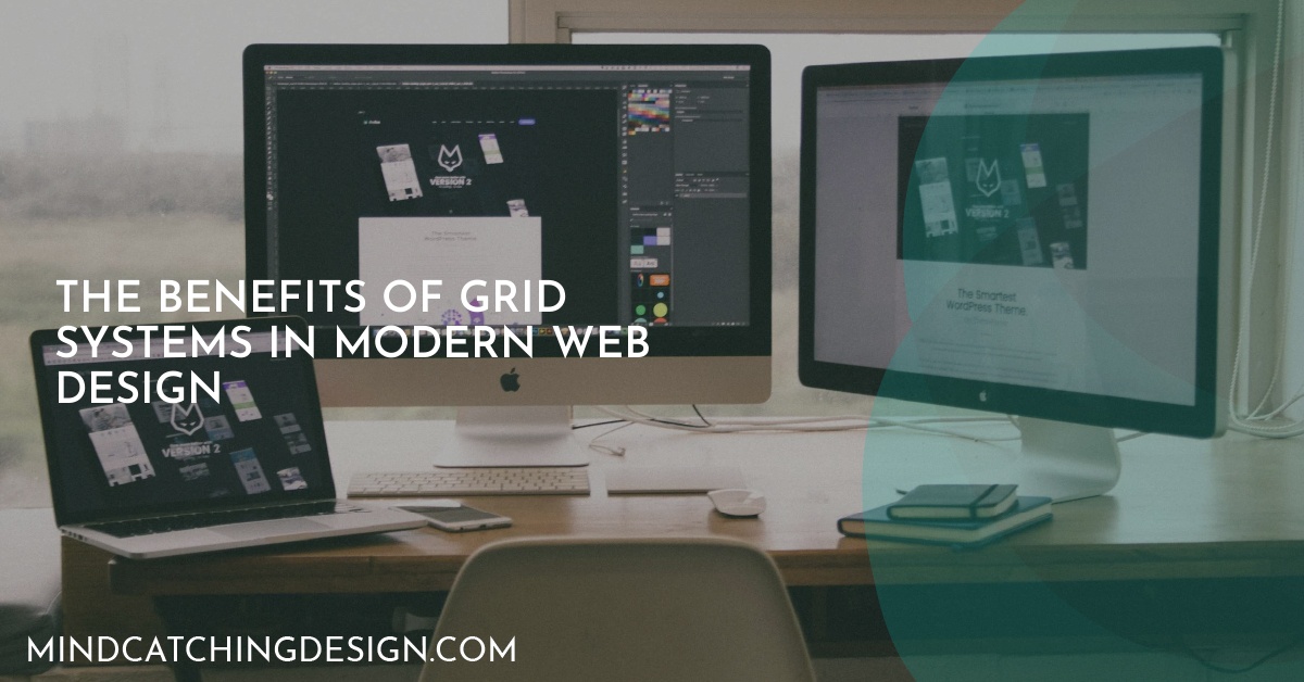
The Benefits of Grid Systems in Modern Web Design
Grid systems bring many benefits to web design. They make websites easier to use and more enjoyable. By using consistent patterns, grids help users find what they need quickly.
This leads to happier visitors and fewer people leaving websites early. Grids also make complex designs easier to read. This is because they help organize information in a clear way.
Enhancing User Experience and Usability
Grid systems make websites feel familiar and easy to use. They work well on all devices, thanks to responsive design. This means users have a great experience no matter where they are.
Grids adjust to different screen sizes smoothly. This keeps the website looking good on any device. It makes websites more engaging and fun to use.
Facilitating the Design Process
Grid systems also help designers a lot. They provide a solid base to start with, even when ideas are hard to come by. Different types of grids, like single-column or modular, make it easier to organize layouts.
This makes designing faster and more efficient. Designers can spend more time on the creative parts, like the content and look. Grids are a key part of modern design.

Andrew Weston is a web designer based in Austin, Texas, and the creative force behind Mind-Catching Design. With a passion for creating high-quality visuals, Andrew ensures that every website not only captures the eyes but also engages the minds of visitors. Specializing in web design and development, Mind-Catching Design offers customizable solutions ideal for small businesses and startups, with negotiable rates to accommodate tight budgets.